
Life’s Ingredients
Samyang delivers value and convenience to people everywhere; Samyang is in tune with the world and communicates with customers.
The new corporate identity is based on an intimate-looking visual language including quotation marks which symbolizes how Samyang’s products and services are always part of our lives.
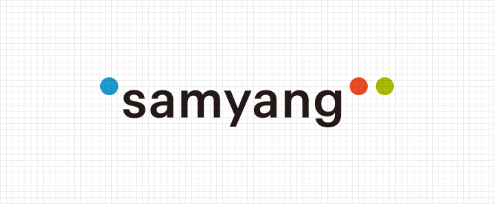
The single quotation mark symbolizes Samyang’s materials technology that’s applicable to many of our products while the double quotation marks stand for our open-minded attitude that communicates with the world through customer-oriented management.
The colors used in the logos—blue, red, and green—are the three primary colors of light representing life’s ingredients through which Samyang shares its value and convenience.
Corporate Logo
Corporate Logo & Slogan

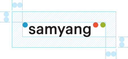
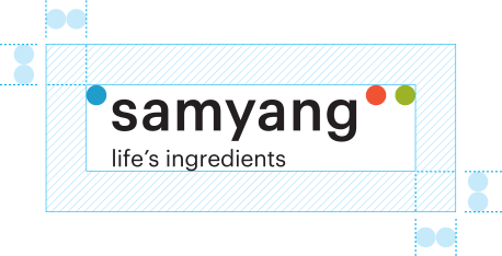
Spacing rules for Samyang’s logos include elements that can secure maximumreadability and attention-grabbing properties. They must also include a minimal amount of space away from other visual elements (typography, photos, and images).

Samyang’s color system is one of the major elements in delivering our Samyang values.
Each object must use color values that are appropriate for the object’s properties. When the difference in brightness or chroma is large, however, Panton color can be used for adjustment purposes. The use in RGB mode may differ depending on the media, but it can be adjusted based on the proposed color.

The signature system indicates Samyang’s logo and slogan or a form combined with an affiliate’s name. Since this is delicately adjusted in consideration of each element’s harmony, it is not permitted to combine the system with any elements other than those prescribed and it is recommended to be used in its original form.
